In the world of competitive barbeque, the Kansas City Barbeque Society (KCBS) stands out as a premier organization, hosting numerous events across the United States and internationally. For barbeque enthusiasts and data aficionados alike, I have taken on the exciting task of transforming the extensive KCBS competition results dataset into a comprehensive Power BI dashboard. This dashboard is designed to offer insights into the competition landscape, highlighting key performance indicators (KPIs) and trends over time.
Dashboard
About the Dataset
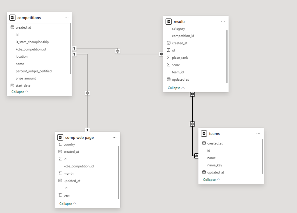
The dataset, sourced from Kaggle, encompasses competition results up to November 2018. It includes four main tables:
- Competitions: Contains data about each competition, including prize value, date, and location.
- Results: Details each team’s score and rank within various categories at the competitions.
- Teams: Identifies each team, though detailed dimensional data is limited.
- Competition Web Pages: Provides additional meta-data from the KCBS events pages.
Competition Format and Scoring System
A standard KCBS competition features four categories: chicken, pork ribs, pork, and brisket. Judging is conducted by trained and certified judges who score entries on appearance, taste, and texture. The scoring system is rigorous, ensuring that only the best BBQ is awarded. The scores for each category are combined to determine the overall competition winner, with maximum scores calculated based on weighted dimensions.
Scoring Breakdown
Each entry is evaluated on three dimensions: appearance, taste, and tenderness. Scores range from 1 to 9, with 9 being ‘excellent’. The final score for a category is a sum of weighted scores, with the lowest score discarded. This rigorous system ensures fairness and high standards in BBQ competitions.
Building the Dashboard
Initial Data Exploration
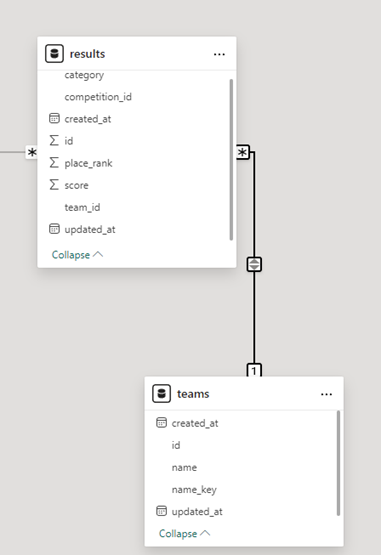
The first step in this project involved uploading the dataset into Power BI and examining it in Power Query. The data appeared mostly clean, but configuring the data model required attention. I ensured that primary and foreign keys were correctly specified to establish relationships between tables. This process involved handling a one-to-many relationship between the results and competitions tables and resolving a many-to-many relationship issue between the results and teams tables.
Data Cleaning
To fix the cardinality issue, I removed rows without IDs and corrected any errors in the ID columns. This cleanup was crucial for accurate analysis and visualization. Ensuring clean data is a foundational step in any data analysis project, as it directly impacts the quality and reliability of insights derived.

Data Model Configuration

Inside the data model, primary keys and foreign keys are specified to establish relationships between tables. The Competitions and Comp_Web_Page datasets exhibit a one-to-one relationship, which could potentially be merged into a single table. However, for this project, I maintained them separately to preserve their unique dimensions. Establishing a one-to-many relationship between the Results and Competitions tables was straightforward. However, linking the Results table to the Teams table initially resulted in a many-to-many relationship. Resolving this involved cleaning the Teams table to ensure unique IDs, thereby converting it to a one-to-many relationship.

Dashboard Creation
With a clean and well-structured data model, I proceeded to create the dashboard. The resulting dashboard showcases several KPIs and visualizations, making it easy for users to explore the data and gain insights. Here’s a breakdown of the main components:
- Prize Amount: Displays the total prize amount awarded across all competitions, amounting to $36.93M.
- Competitions: Highlights the total number of competitions (4632) and championships (4041).
- Teams: Indicates the number of participating teams (25.64K).
- Average Score: Shows the average score achieved by teams (250.96).
Visualizations and Slicers
The dashboard includes various visualizations and slicers for detailed exploration:
- Championship Status: A pie chart differentiating between state championships and other competitions.
- Prize Amount by State: A bar chart illustrating the prize distribution across different states.
- Average Score by Team: Highlights the top-performing teams based on average scores.
- Prize Amount by Judge Certified %: A scatter plot showing the relationship between prize amounts and the percentage of certified judges.
- Top Categories Tree Map: Displays the top categories in competitions, allowing users to filter data by specific categories.
- Prize Amount Over Time: A line chart tracking prize amounts awarded over the years, revealing trends and patterns.
Key Insights
From this dashboard, several insights emerge:
- Dominant States: Missouri, Kansas, California, Georgia, and Arkansas lead in terms of prize amounts awarded. This insight highlights the competitive BBQ hotspots across the United States.
- Top Teams: Teams like J&J’s Southern BBQ and 5 O’CLOCK Somewhere consistently score high, showcasing their expertise and consistency in competitions.
- Prize Trends: Prize amounts have shown an upward trend over the years, with occasional fluctuations. This trend indicates growing popularity and investment in competitive BBQ.
In-Depth Analysis of Visualizations
Prize Amount by State
The “Prize Amount by State” bar chart provides a visual representation of which states are leading in BBQ competitions in terms of prize money. Missouri and Kansas, as expected, dominate the leaderboard, reflecting their strong BBQ traditions and numerous competitions.
Average Score by Team
The “Average Score by Team” chart highlights top-performing teams, offering insights into the consistency and skill levels across various competitions. Teams like J&J’s Southern BBQ and 5 O’CLOCK Somewhere consistently achieve high scores, making them notable competitors in the BBQ circuit.
Prize Amount by Judge Certified %
The scatter plot titled “Prize Amount by Judge Certified %” illustrates the correlation between prize amounts and the percentage of certified judges. This visualization provides an interesting perspective on how the certification level of judges might influence prize distributions.
Top Categories Tree Map
The “Top Categories Tree Map” showcases the most popular categories in BBQ competitions. It allows users to filter data by specific categories, providing a detailed look at performance across chicken, pork ribs, brisket, and more.
Prize Amount Over Time
The “Prize Amount Over Time” line chart tracks the evolution of prize amounts from 2008 to 2018. This visualization reveals trends, spikes, and dips in prize distribution, offering a historical perspective on the growth and changes in competitive BBQ.
Challenges and Solutions
Data Cleaning and Preparation
One of the main challenges was ensuring the data was clean and well-prepared for analysis. This involved removing rows with missing IDs and correcting errors in the ID columns. These steps were crucial to establish accurate relationships between tables and ensure reliable analysis.
Resolving Cardinality Issues
Another significant challenge was resolving the many-to-many relationship between the Results and Teams tables. By cleaning the Teams table and ensuring unique IDs, I was able to convert this to a one-to-many relationship, facilitating more accurate and meaningful analysis.
Designing an Interactive Dashboard
Creating an interactive and user-friendly dashboard involved thoughtful design and implementation. The goal was to provide a comprehensive view of the data while allowing users to explore specific aspects through slicers and filters. This required careful selection of visualizations and KPIs to ensure they conveyed the most relevant and insightful information.
Future Enhancements
While the current dashboard offers a wealth of insights, there are several areas for potential enhancement:
- Integration of Additional Data Sources: Incorporating data from other BBQ competitions or related events could provide a more comprehensive view of the competitive BBQ landscape.
- Advanced Analytics: Implementing advanced analytics techniques, such as predictive modeling or sentiment analysis of judge comments, could offer deeper insights into competition dynamics and team performance.
- User Customization: Adding features that allow users to customize their views and save personalized dashboards could enhance user experience and engagement.
Conclusion
This Power BI dashboard not only brings the KCBS competition data to life but also provides a valuable tool for BBQ enthusiasts, competitors, and analysts. By visualizing the data, we can better understand the dynamics of competitive BBQ and appreciate the hard work and dedication of the teams involved.


